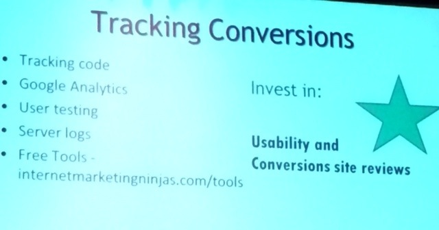
#Pubcon Liveblog: Conversion Web Design
Presenter Kim Krause Berg @kim_cre8pc, Internet Marketing Ninjas, will talk about how to get your ducks in a row before you start building your site and always include conversion elements in your design.
Conversions are turning visits into sales. You think conversions are making money, getting subscriptions, increasing form submissions, increasing sales leads.
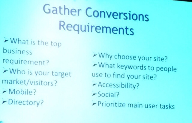
Your target users think conversions are …
- Do you have what I need?
- Are you genuine, credible?
- Do you provide excellent customer service?
- Prices?
- Opt-in/opt-out signup
- Are they spying on me?
- Will I be able to read it?
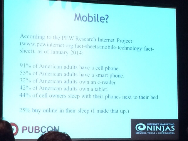
- Can I access the site from my phone?
- Can I get in and out in a hurry?
Persuasive conversions design is purposeful website design. With usability you’ll find there’s a lot of “abilities” not being met. You’ll see confusability, such as competing sign up/sign in links. If you want to increase conversions, remove blockages and distractions. Meet user expectations in navigation and links. She shows the Forever21 navigation with links that say 21 St. and Love 21 — it’s not clear to the user what those are.
Customer service is a simple area to improve conversions. Make it clear what is supposed to be clicked, or why they should click via triggers and call to action.
Search Engines and Social
Search = Findability = Usability = Increased Conversions.
It matters to you because it affects search engine rank, PR scores, landing pages that convert, authority and brand reputataion.
Make your “follow me” social call to action count. Add your social networks to your site and provide a reason for visitors to follow.
#1 tactic: provide answer at the point of the question.
- Before sliders, add introductory text and a heading
- Add action words to nav link labels
- Make calls to action obvious
- Avoid gray text
- Test for color contrasts — see tool joedolson.com/tools/color-contrast-compare.php
- Use common terms
- Remove distractions
- Provide proof
Common designs that decrease conversions:
- Mystery links
- Unidentified links
- Readability
- Understandability
- Navigation/poor IA
- Functional errors
- Credibility
- No page consistency
- Rendering on various devices
- Load time
- Ads
- Moving images
- Calls to action below fold
Free Mobile Eumulator: http://mite.keynote.com — you can view your site as seen on a variety of devices.
To communicate a sense of place:
- Choose keywords for content headings
- Research taxonomies. what terms do your target visitors use?
- Breadcrumb navigation
- Scrolling — easy to hide call to action
Information Architecture Tools: IA and conversions are closely tied. Build your site so your sales funnels are built in and people can flow along. Look at tools Mock Flow, Balsamiq and Slickplan.
Check out her free ebook “The Secret to Natural Website Conversions.”
Karen Thackston is Kim’s choice for lessons about marketing writing for conversions.
26,000+ professionals, marketers and SEOs read the Bruce Clay Blog
Subscribe now for free to get:
- Expert SEO insights from the "Father of SEO."
- Proven SEO strategies to optimize website performance.
- SEO advice to earn more website traffic, higher search ranking and increased revenue.
LEAVE A REPLY
