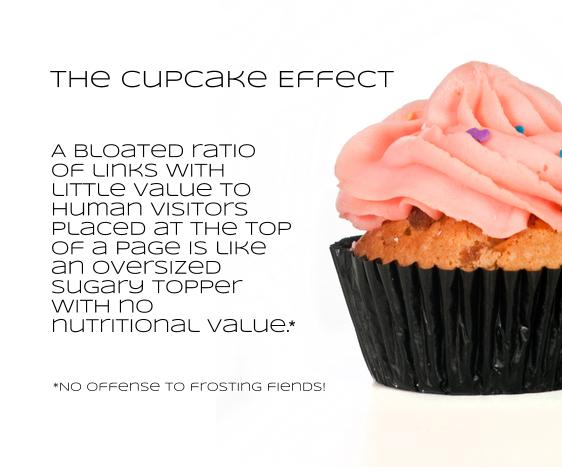
The Cupcake Effect: Too Many Links, Not Enough Content
There are many reasons sites go bad. I recently came across a site that has an SEO problem with links. The home page is one long stack of about 200 links. The content on the page can be described as:
- One sentence describing the site
- Headings to categorize each pile o’ links
- Link anchor text
This site bills itself as a resource and education center for an industry. In this post I’ll use kitchen supplies for a stand-in vertical. In this context, the home page looks like this:
Kitchen King Resource CenterFor all your kitchen, stove top, oven, baking, mixing, chopping, cooking, and serving needs New Cooking Classes! Perfect Food Pairings Apple mixes it up with Tim Cook at front of the house Kitchen Tool Tutorials Better baking with power tools [It goes on…] |
Good Links, Bad Links and Cupcakes, the Enemy
What we’ve got right now is a prime example of the cupcake effect in action. Links on top of links with little text content.
There are probably 200 links to these resources on the home page. There are about 25 categories that these resources are divided by. Some of them are subcategories of other categories — which is to say organization is lacking. Obviously, this page is employing bad SEO practices; topic relevance isn’t especially clear. But more importantly, it’s providing a sub optimal user experience. Kinda like this:
Solving the Problem with Cupcakes
It goes without saying that linking to content both on-site and off-site is good. Critical. The stuff the web is built on. But link abuse has led to too many junk sites. If you’re pointing to another location on the web, explain what it is that the link leads to that would be useful to your visitor.
Siloing for User Experience
If you find yourself with a cupcake problem on your hands, then don’t worry – there’s a solution. Silo the website. This involves planning the themes covered by the site, organizing the site based on those themes, and providing adequate content to support those themes.
1. Content Themes
The first thing to do is to plan the site themes. Take a critical look at your content and divide the site up into logical themes. In the case of Kitchen King, the links on the home page have headings, but they can be grouped more effectively. Right now there’s a lot of overlap and sub-categorization. For example, categorization is happening along the lines of: kitchen appliances, stainless steel kitchen appliances, electric kitchen appliances, General Electric kitchen appliances, stand-mixers and hand-mixers.
A more user-friendly categorization will be divided into the most necessary broad umbrella categories, from which a site visitor can refine their needs. It might look something like: kitchen appliances, cooking classes and recipes. Depending on the site, designing the silos might require an element of art and science. If you’re new to the site, your fresh eyes might be able to intuit logical themes to silo. If you’ve been living with the site for a long time, it might require some research (keyword or competitor) or user surveys to understand the top-level themes of the site.
2. Site Navigation and Internal Linking
From there, architect the site on the pillars of these themes. The site navigation can be built with these themes in mind. From any silo, a visitor should be able to explore the topic. A resource center like Kitchen King can have sub-navigation to help visitors drill down into a topic. Carefully considered internal linking is also important. Keep linking on non-landing pages to other pages within the silo. Links should be placed where they make sense for a visitor. Testing your site navigation, design and new pages with real people is going to give you invaluable feedback.
3. Content Support
Another problem that Kitchen King and other sites suffering from the cupcake effect have is inadequate content. Content comes in many forms. What’s especially lacking in Kitchen King’s case is text that describes what the resources are. Links are most valuable to the reader when there’s an explanation of what the link will provide. Kitchen King would be much more useful to readers if these links were placed in context. Think about how much more helpful the home page of Kitchen King would be if the categories were better organized and there was descriptive text along with the links.
Efficient site architecture and supportive content is the solution to the cupcake problem. A site suffering from cupcake bloat can be treated with a steady diet of organizing the site into themes and reflecting those themes in an intuitive navigation and content. Add these three ingredients into your cupcake recipe and you’ll find search engines and users coming back for more.
26,000+ professionals, marketers and SEOs read the Bruce Clay Blog
Subscribe now for free to get:
- Expert SEO insights from the "Father of SEO."
- Proven SEO strategies to optimize website performance.
- SEO advice to earn more website traffic, higher search ranking and increased revenue.

LEAVE A REPLY


