7 Site Usability Mistakes That Bug Me
Hi, my name is Lisa and I have a problem. During the day I work for a pretty cool search engine optimization company, but you see, eventually I go home. And when I do, I turn into a regular searcher. I have needs and I’m looking to your Web site to help me fill them. Some of you are doing a great job (I heart you), but there’s a bunch of site owners who are letting me down.
For whatever reason, I’ve been doing a lot more searching lately than usual and I’m finding a lot of great stuff. I’ve been seeing an impressive number of sites that clearly understand what search engine optimization is and why being well-branded on the Web is important. But somehow, these same sites are still committing all sorts of usability and design faux pas. I’d like them to stop.
Here are some of the common usability mistakes that bug me and that you should absolutely avoid making on your site:
1. Your Site Content Isn’t Written For the Web
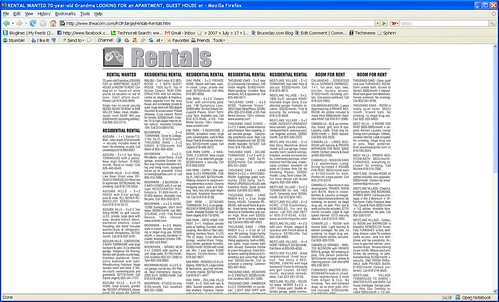
My lease is almost up on my apartment and I’m trying to find a new apartment complex that sucks just a little bit less than the one Swat, Jack-Jack and I are currently living in. I decided to consult the Web site for The Acorn, a local classifieds publication, for assistance. Here’s what their rental listings page offered me:
You see what they just did there? Instead of creating a usable Web-version of their content, they decided to just scan what they already had in print. Nice.
Are you kidding me? If you want to know why sites like Craigslist and Facebook are ruling marketplace listings, it’s because they know how to make their content usable. Scanning your content and placing it on your Web site, does not a Web presence make. The Acorn is losing out on potential new subscribers doing things the way they are. Either you’re going to have a Web site or your not. There’s no middle ground.
Dear Acorn, please fix this. Also, consider renaming. Thanks.
2. Confusing Navigation/ I Can’t Use It
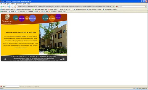
Here is one of the apartment complexes I was considering:
Click through and try navigating through the site using Firefox. Tricky, eh? Sure, sometimes you get lucky and you can actually click on something, but most of the time, the home page (which, BTW, has the ugliest URL ever) renders completely unusable. Bad.
Oh, and don’t even get me started on all the empty white space they’re not taking advantage of.
3. You Talk To Me without Asking
There is one thing that will send me running from your Web site without fail: if I land on it and you immediately start talking to/singing at me without my permission, for no reason.
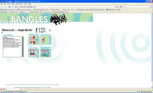
I didn’t think sites still did this, then I visited The Bangles Web site (shut up, they were playing at a local fair recently) and was forced to listen to their "Web site Greeting". In case you were curious (I wasn’t), their "greeting" is basically just a recording of the ladies talking over one another. As soon as I heard it, I was so totally gone. Don’t force users to interact with the media you have on your site. Audio and video features should always be opt in, not opt out.
4. Your Site Is Designed Entirely In Flash
I get it, you like Flash and making your Web site pretty. That’s great, but guess what, I don’t. And your users may not either. Some of them may not even be able to access it. That’s a great way to alienate a whole bunch of people.
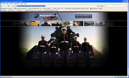
It bothers me when most sites opt to do this, but it really bothered me that the Marines chose to. I’m on the Marines’ Web site because I want information; there’s even a good chance that I may be somewhat frantic when I get there. Make it easy for me to find out what I need to know. There’s a very good chance that I’m not going to want to see a movie or look at an endless line of staged pictures. Anticipate these needs.
Also, unless there’s an HTML-complement to it, your site map should not be designed in Flash. Marines, please change that.
5. You Use Tiny, Tiny Product Photos or None At All!
Searchers and shoppers are known for being visually oriented. If you’re a manufacturer or ecommerce site, you need to be including product photos on your site to help guide users. But just as important as having photos at all, is having usable photos. Don’t just stick users with the thumbnail. Give them some way of zooming in or clicking through to a larger secondary image.
Customers want to see what they’re getting before they agree to buy. I want to be able to zoom in and see actual apartment floor plans. I want to see the trim on that jacket. Bigger photos allow for more detail and allow users to trust that you’re going to give them what you’re promising.
Think about it: Would you buy a product without being able to see it first? I wouldn’t.
6. Not Changing the Color of Visited Links
You’d think that in 2007 this would be pretty obvious, but surprise, it’s not. Good, user-friendly, accessible Web sites tell their users where they are, where they’ve been and where’s left to go. They don’t keep them in an endless cycle of "did I click on this yet?"
Realize that your users aren’t traversing your Web site in a straight line. They bounce around until they find what they’re looking for. They may not realize that they’ve clicked on the same link 5 times until they’ve clicked on it time number 6. If you’ve ever been in this situation, you know how frustrating it is. Make it easy for users to tell where they’ve been by differentiating the link color. It just makes everyone’s life easier.
7. You Immediately Break My Trust
I’m not going to lie, when I’m on your Web site, I’m judging you. Big time. If you make me register before I can even access your site, I’m going to assume you have something to hide and I’m going to leave.
If your site is filled with typos, I’m going to assume you’d take the same care with my order that you did with your copywriting. See ya!
If your Title tag reads "Welcome To My Site", you type in ALL CAPS, or you’re still rocking the frame, I’m going to assume know that you’re stuck in the ’90s and decide not to do business with you.
Site usability and site design matter. Search engine optimization and good rankings are important, but they don’t mean a thing if you’re turning users off as soon as they click through to your site. Take the time to really examine your site and see where it needs work. Is the message you’re sending the one you intended to send out? Do users enjoy interacting with your site? Or are you bugging them?
26,000+ professionals, marketers and SEOs read the Bruce Clay Blog
Subscribe now for free to get:
- Expert SEO insights from the "Father of SEO."
- Proven SEO strategies to optimize website performance.
- SEO advice to earn more website traffic, higher search ranking and increased revenue.
17 Replies to “7 Site Usability Mistakes That Bug Me”
Moshin, you’re absolutely right, we do use Flash. We also provide text navigation at the bottom of every page for those who prefer to navigate that way. It’s all about the options. ;)
Whilst having audio and video auto-play is annoying for many visitors, and frankly I hate it too, in tests I’ve found those sites convert significantly better.
Fabulous points and well taken! Sometimes no matter how many times you have done something correctly, you forget to do something you know perfectly well how to do and to do. None of us should take phone calls before we have finished a task!
RE Firefox, my latest update on my Mac with OSX 3.9.9.9.etc has corrected many problems I used to have and the point #2 site works just fine for me. But I also had a lot of problems with some sites until I double checked my firewall which some update had set on Maximum Protection.
Also I did not have the same reaction to the site on #2 you had. However, if I was looking for a place to live, I would want to find right up front how much it was going to cost me before I invested a lot of time wading through navigation and stock photos. I still think the WIIFM (what’s in it for me) principle holds true and should be answered right up front on every site.
I figured #8 simply covered all the rest of our pet peeves, either that or your phone rang.
Good tips all around – I especially appreciate the one about using FireFox. I was recently trying to use an online virus scan program and found that NONE of the three I was trying to use would work with FireFox. IE is where the problem originated (darn those kids anyway) … I hardly wanted to use IE to run a virus scan.
Again – good tips. Thanks
Great list, Lisa! How about adding this as 7b: Don’t underline text that isn’t a link. Somebody needs to tell Nichebot.com that underlines shouldn’t be used for emphasis on the Web… even tho links are not *always* underlined anymore, there’s still an expectation that anything that is will be a link. Drives me crazy. They also commit word-usage atrocities like “Make minced meat out of the search engines” (um, that’s mincemeat) and talk about how “phenatical” they are about customer service (misspelling “fanatical” not once but twice in the same paragraph!).
I’d like to make an addendum to blunder #2. When clicking through to that website in FireFox, I actually managed to catch one of the links (after many tries), only to be greeted with a Domain Name Mismatch security certificate error. Usability kiss of death for me…
Great tips, thanks!
Lea
Yes a timely reminder to us all. And, oh dear, I still make mistake #6 – will correct this asap.
Thanks,
Steve
dang… i already queued tomorrow’s LED for publishing, and i cited this post when it was 8 Site Usability Mistakes!
now i’m gonna look all dumb and stuff ;)
(i’ll get you for this l. barone)
All very good and valid issues which are quite sadly still very much issues across so much of today’s Web. Good stuff!
Would you consider doing a top 8 list but omitting one of the items (#3) a usability mistake? :.)
LEAVE A REPLY

